I’m willing to explode my blog’s borders for this piece of beauty.
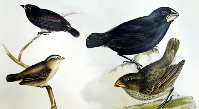
These guys live right here. The field they’re in is probably the one down the street where baloons take off. I think I might have to go talk with them.
I’m willing to explode my blog’s borders for this piece of beauty.
These guys live right here. The field they’re in is probably the one down the street where baloons take off. I think I might have to go talk with them.
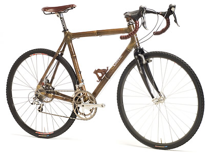
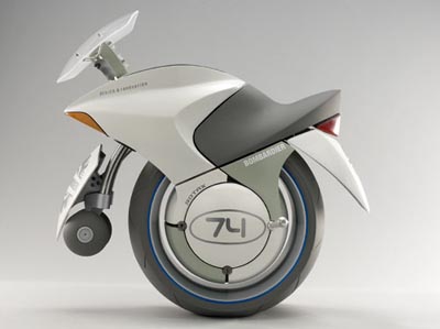
Check out this bikely hotness. These are minimum carbon footprint bikes made of bamboo and (ironically) carbon fiber.
Take that, Ben “Peak Oil Means No One Has Bikes” Lehman!
There’s a website called Eyes on Darfur . In it, you can see satellite photographs of villages that have literally been destroyed by fighting there.
Let’s think about that for a moment. The core defense of the Government of Sudan has been “Nuh-uh!” for years. They’ve kept away UN observers and peacekeepers on the grounds that nothing’s going on. But the satellites fly overhead every few minutes. They see the smoke, they see the fire, and they see anything 2 meters wide and bigger. Like, say a Land Cruiser with machine guns mounted in the back.
Now, let’s consider using Shock: for something like this. Let’s talk about using Satellite photos or Google Earth as a Shock. Or the Space Station. Or camera phones. This might be a really interesting way to play. It loses the level of abstraction that, say, “Furries” and “Interstellar travel” give you, but it might gain some meat from familiarity.
Anyone who wants to, come over. We’ll play like this and see how it goes.

It’s often said that the milling machine was the first tool that could be used to make copies of itself. I think that distinction goes to the hammer, but the point is not lost: a device of great complexity that can be used to make and modify itself is approaching a life-like complexity that makes the tool exponentially greater as a phenomenon.
Well, since 2005 or so, the RepRap project has been going on, making a machine that could make itself that makes open-source hardware possible. The creators claim that the device, when fully functional, will cost $400 to build. Or, of course, you could have your friend fab you up a copy. Presumably, it’s your duty to fab one for someone else at that point.
What’s interesting to me about this (and the creators) is that this does for hardware what’s happened with software since its inception: replication means that you can make complex things for cheap. So cheap that they asymptotically approach free. The RepRap can’t make a sandwich, as Jeff pointed out, and that’s actually kind of important: what a lot of the world needs is food, not tools and toys. But when food is to be had, the other things in life — transportation, communication, construction, and of course play — become very important. We’ve satisfied that craving over the last few centuries by buying stuff. Now we may be able to make it. And that may mean the re-emergence of a material folk culture. One not defined by Swooshes and Apples, but by a billion proud signatures and trade marks.
(Thanks to Tomorrow’s Trends for the “Caution: Self-Replicating Devices” sign at the post head.)
Indie Press Revolution, purveyor of fine, independently-published games and books, has a mailing list for said publishers. In it, a particular publisher said,
I know the owner of Dragon’s Lair somewhat, and have shown him [My game] in the past. His comment (which probably applies to many of my IPR brethren), was something like, “The indie format”–by this he meant the physical format of many of our books; [My game] is 9×6, landscape–“doesn’t sit well on the shelves”.
My response was the following:
I encourage everyone to see this for the bullshit it is.
Go to a Barnes and Noble. Look at all the different shapes of books.
Now go to a game store and notice the homogeneity.
What he wants you to do is fit the format so your book literally doesn’t stand out. Your book will be lost. It will be a bunch of work to redesign the book and it will dampen your sales because it will lose its distinctiveness.
This is a general principle of design: if you make something designed simply to be inoffensive, you are designing it simply to not be noticed. If you design distinction, though, things will be different. The game (or whatever it is) will be noticeable. What that store owner is doing is sacrificing the distinctiveness of his individual products in favor of the size of bookshelf he’s purchased.
Now, the be clear, if you made a game that’s eight feet to a side, weighs 150 pounds, and costs 40 cents, you’ll have a hard time getting a retailer to show much interest. It’s not worth it for the shelf space that could be better spent on more normally sized books. But that’s not the issue here. The issue is that the store owner is uncomfortable because things are different than he expected.
Much of the time, when I’m meeting with a design client, I’m listening for some keys phrases they might say. One of them is, “I like it.” This, believe it or not, is a bad sign. It means that a) nothing’s lept out at them (if it had, they would have said, “I like how there’s this little shape here” or something), and b) sometimes a client just doesn’t want to say anything critical and says “I like it” to keep from having to express displeasure, but it sounds like satisfaction.
But sometimes, they say “I don’t like this.” What that usually means is, “I noticed this.” Often, they’ll then say, later, as the meeting goes on and they’ve looked at things more, “This one’s growing on me.” Again, if they actively dislike something, they’ll be able to identify exactly what it is that they don’t like.
Consider that last one. Consider an unusual thing on a bookshelf: something small (Burning Wheel) or something large (Nobilis). I literally bought Nobilis because it stuck out of the shelf and I kept seeing it. I bought Burning Wheel because it was physically small and quietly beautiful, an oasis in a sea of cleavage and comically giant swords. Its smallness and quietness winked alluringly to me from the bookshelf.
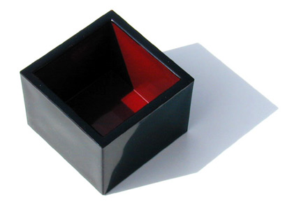
I’ve used some deliberate tools like that on some other books I’ve done. The spine of Shock: is like a laser: a thin little bright line between books. The Mountain Witch is thicker and black, but with this little splash of red. Both are shorter than their counterparts, making them shine even when placed spine-out. When facing cover-out, they both use a variety of tools to get and hold the attention of the proper audience. But they’re both unusual sizes, too. That means that they get more space around them.
The homogeneity of the RPG market is precisely to the advantage of the indie marketer. We’re looking to fill a niche they can’t. We’re making things that are inherently for markets that they haven’t tapped because they don’t want them. Where the business model of Wizards of the Coast and White Wolf is to make their products intercompatible within their own products, our model is to show our distinctiveness between products.
Don’t let anyone tell you any different. When you’re told that you’re missing the market because your book isn’t enough like another one, you’re being offered a ticket to a Journey concert when you can instead be on stage at a local club with a sticky floor, coming away with cash in your pocket and the respect of your peers.
Kenneth Hite, respected RPG reviewer, author, designer, and editor just gave me some big props over on his livejournal, the Prince of Cairo.
Says Kenneth:
… like The Mountain Witch, this book is a triumph of Joshua Newman’s design, which somehow manages to combine occasional bold-face, sidebar/footnotes, and ragged-right margins into a clean, evocative look that is appropriately “Japanese” without being Orientalist or fey.
What’s particularly nice about this is that one of my design goals was to explicitly avoid Orientalist, Legend of Five Rings stereotypes and draw from my love of actual Japanese art.
Lots of this:
and a little bit of this:
And Kenneth was nice enough to notice.
Thanks, Kenneth!
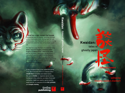
The first supplement for The Mountain Witch will be at GenCon this year, Kwaidan: Tales of Ghostly Japan. It’s a collection of Lafcadio Hearn’s stories and poetry edited by Timothy Walters Kleinert with book design by me. You could consider it an extended bestiary for The Mountain Witch, which is how Timothy considers it. I’m very happy with the way the book turned out, in no small part due to the extraordinary cover illustration by W. Don Flores, whose work graces the pages of the game itself.
It’ll be available at GenCon at the Forge booth, #1237, alongside The Mountain Witch, Shock:, Under the Bed, Dogs in the Vineyard, The Princes’ Kingdom, The Shadow of Yesterday, and lots of other good stuff (that, unlike these, I don’t have my fingers in). Come visit us, play some demos, and pick up some creator-owned games!
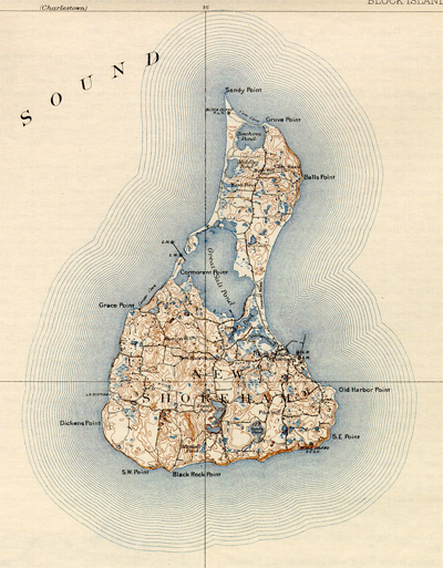
OK, I’ve mooned over my honey, and now I’m out of money. So I’m back from Block Island and back in the saddle.
I’ve got a couple of graphic design jobs going on — a landscape architect who seems like a really good guy, and a woman whose company makes baby slings. The second is an ongoing, large-scale (for me) corporate identity. The first, I dunno; I’ve only met with the guy a little bit for a tangentially related project.
But, of course, that’s not what I’m hot about (though I am excited to get paid). This is what I’m excited to do:
I’ve got some illos to do for Shock: and then it’s done. I think I’ll do three more. One, I managed to start on our trip to Block Island and needs a few more hours. I’m not sure what to do for the rest.
I’m working on a top-secret project with Clinton R. Nixon (probably one of many over the next year or so). The Eisner-nominated Jennifer Rodgers has already done the cover illo and it’s beautiful.
I’m also working on a collection of Japanese ghost stories with Timothy Kleinert, as a sorta-supplement for The Mountain Witch. This project is exciting to me because I love these stories. They’re sort of a Mother Goose of Japanese folklore, assembled by a relative outsider, Lafcadio Hearn, who eventually became an unlikely Japanese citizen. The book will be largely stories from Kwaidan, his major collection, with some others Tim feels are appropriate and full of Japanese ghost creepiness.